Evolving the u&u brand for the next chapter
A snapshot of the work I would focus on in my first 30 days at u&u—modernising the brand, sharpening its business appeal, while preserving the legacy character that remains a key point of difference.
-
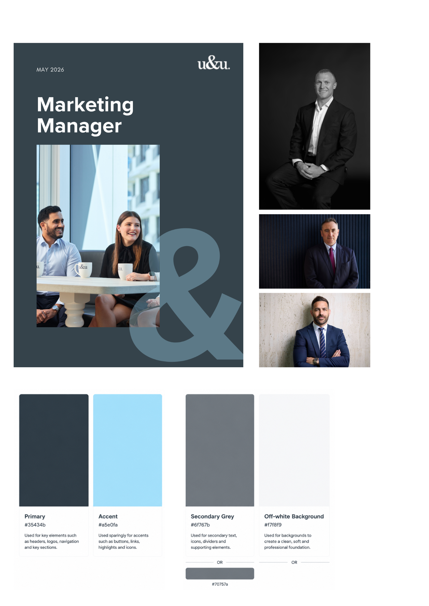
This refreshed colour palette has been designed to position the brand as professional, contemporary and people-focused, while creating a cleaner and more cohesive visual identity.
The primary slate (#35434b) provides a strong and credible foundation, reinforcing trust, expertise and professionalism — qualities essential within the recruitment industry. Importantly, the existing accent blue (#a5e0fa) has been retained to preserve the brand personality that u&u is known for. The colour carries familiarity, energy and approachability, ensuring the refreshed palette evolves the brand rather than moving away from its established identity.
To support the palette, a softer secondary grey (#6f767b / #70757a) has been introduced to create balance and flexibility across collateral, digital assets and supporting content, while the off-white background (#f7f8f9) keeps layouts feeling clean, light and premium.
Importantly, the previously used harsh black has been removed from collateral and social media applications. While effective for contrast, it often appeared too stark against the light accent blue, creating visual heaviness and a more crowded aesthetic. Replacing this with softer, more refined tones creates greater visual harmony and delivers a more polished, sophisticated and contemporary brand presence.
-
To align with the refreshed brand palette, I recommend modernising u&u’s headshot style by reducing the dominance of the bright blue background treatment. As blue is now being retained as an accent colour rather than a major brand element, softer and more natural photography will create a more personal and contemporary feel, allowing u&u’s people to remain the focus while maintaining the recognisable brand personality the business is known for.
-
A comprehensive refresh of u&u's collateral would be a key next step. This includes job adverts, position descriptions, EVP materials, and parental leave documents — all of which would benefit from being realigned with the recommended changes to ensure consistency in tone, branding, and strategic messaging.
In particular, the position descriptions warrant priority attention. The version I received was low-resolution and difficult to read, which presents an opportunity to redesign these documents into clear, on-brand, and candidate-friendly assets that better reflect u&u's market position.